Polling and Pollsters (9.26.20)
A Primer
This week’s focus was polling. Amanda Cox of The Upshot visited lecture and gave insightful comments on the state of polling in the age of Covid. In lab, we learned more about polls as they relate to predicting electoral outcomes.
We were given a few datasets to help with this week’s lab. Two included polling averages in presidential elections dating back to 1968 (national and by state). We also received raw polling data for the 2016 election and for the current race. This dataset included FiveThirtyEight’s pollster ratings, which evaluate firms based on both historical accuracy and statistical rigor.
Finally, a new concept in lab was ensemble models. Essentially, these models take predictions from a multitude of other models and weigh them accordingly.
With all of this in mind, I wanted to answer four questions with this week’s blog post:
(1) Are the pollster ratings evenly distributed? (It’s more of a normal distribution, albeit with a lot of firms not yet rated.)
(2) Do these ratings vary by methodology? (Phone polls are generally viewed as higher quality.)
(3) Can I update my models to include polling averages? (Yes, and this helps greatly in predictions.)
(4) Lastly, what would my own ensemble model predict for this year’s election? (Biden winning in a landslide.)
Pollster Ratings
Each poll within the dataset of 2020 polls has its own rating from FiveThirtyEight. After filtering for general election polls and creating buckets of pollster ratings (“Good”, “OK”, and “Not Great”), I created a simple visualization of pollsters and their ratings.
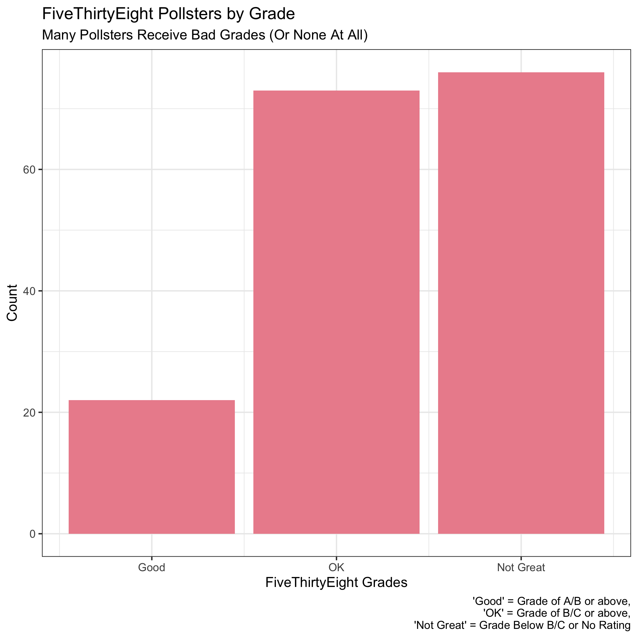
There are three takeaways from this histogram:
(1) Only a select number of pollsters (far less than one-third) qualify for a “Good” rating (above a B+).
(2) There are many “Not Great” pollsters. This is mainly due to pollsters without ratings. Going forward, I will filter them out before making visualizations. For this historgram, however, including them helps make clear that there are a relatively small number of trusted pollsters.
(3) With these in mind, it becomes clear that FiveThirtyEight’s intentions with pollster ratings is for more of a normal-looking distribution instead of ratings evenly distributed across grades. This makes sense from a lot of angles, specifically in rewarding rigorous pollsters.
To test this, I created the plot below.
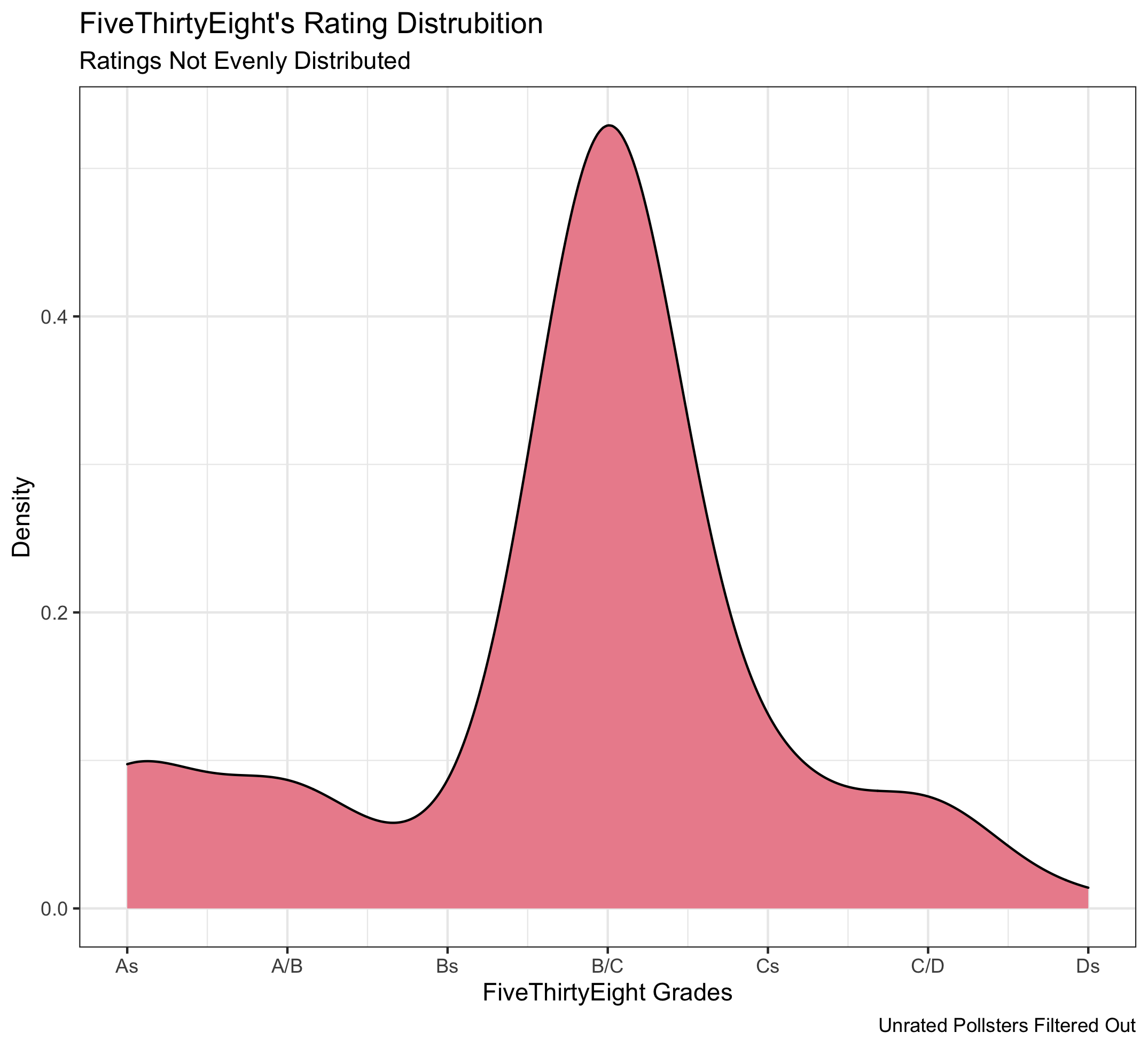
FiveThirtyEight’s most common rating (by far) is a B/C.
Methodology
As discussed in lab, phone polling is generally viewed as more robust than online polling. Part of this is because some online polls are subject to manipulation, and, broadly speaking, phone polling should reach a more representative population than online polls. I wanted to see if this assumption holds true in FiveThirtyEight’s pollster ratings.
There are three possible outcomes. The assumption may hold true, meaning the website gives higher polling ratings to predominantly over-the-phone polls. On the other hand, since there is a perceived bias toward trusting phone polls, it is also possible that online pollsters work harder to ensure a representative sample, which FiveThirtyEight rewards with higher grades. All that said, it’s also possible there is a similar distribution between the two mediums, which would also make sense.
The visualization below segments each individual poll by methodology. I took raw polls (instead of grouping by pollster) to get a sense for the general polling environment, since some pollsters may produce significantly more polls than others. For polls that contained both online and over-the-phone elements, the dataset seemed to indicate which medium was used more by listing an online/over-the-phone method first.
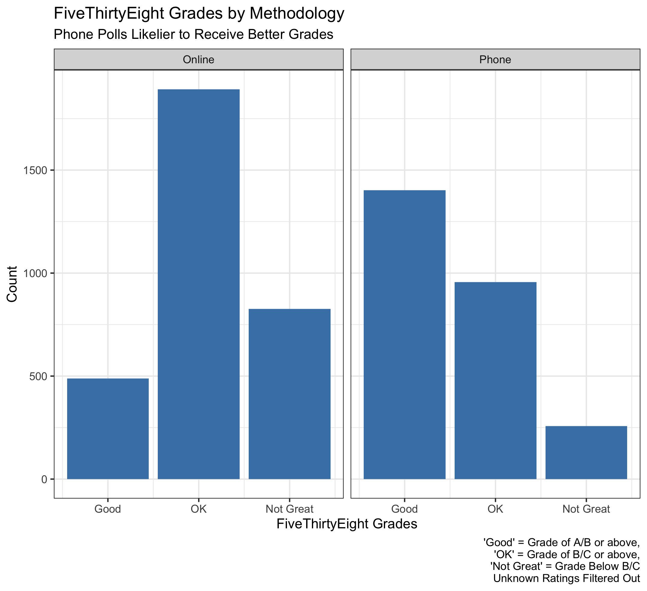
A few takeaways from the graph:
(1) There is more online polling than over-the-phone. This is probably due to cost, but it is interesting that it still holds true when filtering out unrated pollsters (since new, spontaneous pollsters are likely unrated).
(2) Phone polls tend to be higher-rated than online polls. This lends credence to the assumption that phone polling is more rigorous.
(3) There are a significant amount of well-rated phone polls. This may be because phone pollsters with the capability to produce large number of polls also have the resources to be very rigorous and the track record to be predictive.
A nice extension of this work would be to see if national and state pollsters differ in rating or methodology. This may be worth looking into next week.
Model Building
I then moved onto building a new model for this week. I intended on simply adding the polling averages data to the previous model. However, I wanted to also add in lagged national popular vote share (as I mentioned last week) and switch around my economic indicators. In the end, I created three models: one on fundamentals (which will be used later), and two using polling averages.
I decided to set two thresholds for my polling models. One would look at a small snapshot of the race in late August. To accomplish this, I took all polls conducted when there were 10 weeks until Election Day, which should encompass the state of each race before debates begin. The second threshold was within two weeks of the election, which was intended to capture last-minute swings.
I took both of these polling averages and added in lagged two-party vote share, real disposable income growth (over a presidential term), and incumbent party (which was in my models last week). Importantly, 2020 data was left out, so I could create predictions later on. I compiled the results in a stargazer table below:
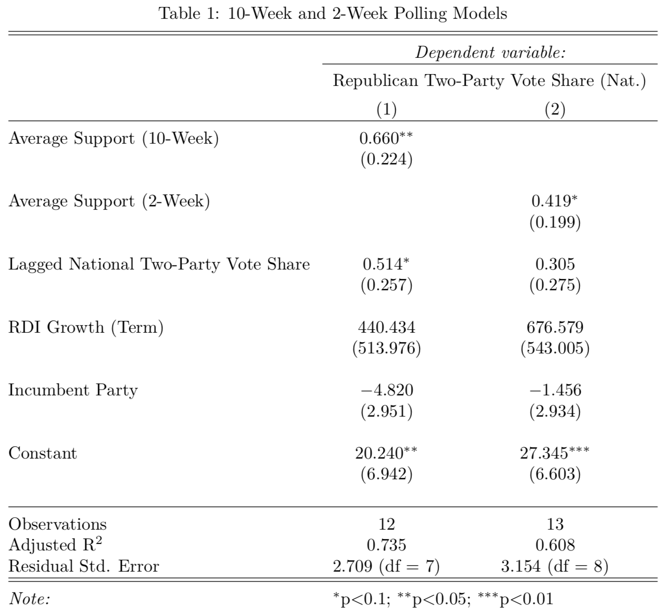
There are two implications from the model:
(1) 10-week support is more significant than 2-week support, and the model with 10-week support also explains more of the variation (by adjusted r-squared) than the 2-week model. This is rather surprising, but it may be possible that two-week support does not add much more useful information than the electoral mood in late August. This may also have to do with polling quality very close to the election, where pollsters may rush to have output before Election Day.
(2) As a whole, both models are relatively explanatory (at least, much more so than last week). Polling and lagged vote share seem to help a lot here.
Ensemble Model
After creating these poll-based models, I returned to the concept of ensemble models discussed in lab. This week, I opted for a simple ensemble model that weighs each of my three models (fundamentals, 10-week, and 2-week) equally. For the two-week model, I used Trump’s current polling average as a benchmark for what his polling average will look like a month from today. Of course, this could change drastically.
I purposefully left out any 2020 data so I could predict Trump’s two-party vote share as a test. The visualization below shows those predictions for each model, then for the ensemble:
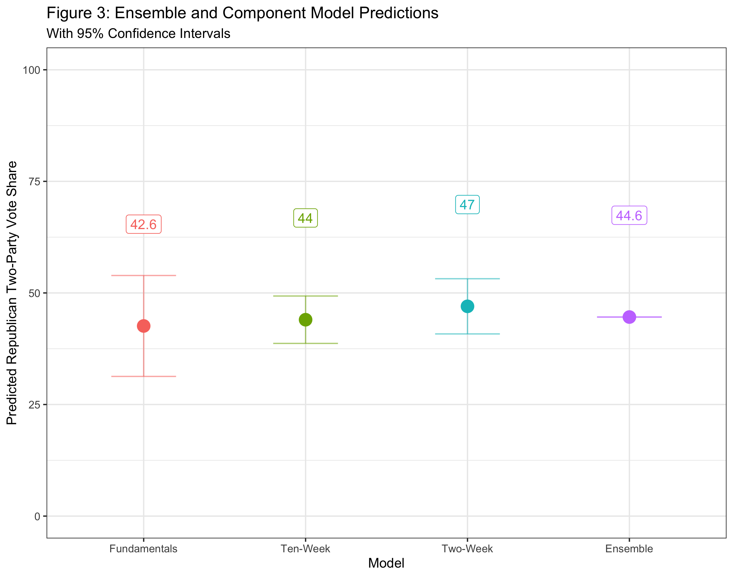
The ensemble model suggests that Biden has a healthy lead. True to form, it lands in the middle of the three other forecasts. None of the forecasts currently predict a Trump popular vote victory, although it is always possible he could win the Electoral College without a popular majority.
There are a few aspects of my work worth tweaking in future weeks:
(1) Having a more expansive snapshot than just polls conducted when there were 10 weeks until Election Day. A pre or post-convention polling average may be useful here.
(2) Finalizing economic indicators and sticking with them throughout the rest of the class.
(3) Writing code that will auto-update economic indicators and polling averages as we get closer to November 3rd.
(4) Trying out different weights for the ensemble model.
(5) Finally, a pseudo-Bayesian model that generates Trump’s two-week support through a probability distribution. This could be interactive in a Shiny app!